Saturday 26 February 2011

110226 - The Week In Pictures

What an interesting week we had! Risk off again with big increases in JPY and CHF, at expense of USD, GBP and EUR. Watcher big account is now just under 200% up since September last year, small account up at 127%. Since both accounts operate without stop loss, its a bit of an art to get the lot sizes correct so that the account does not become over-traded. I think the changes I made in Jan, just after the account doubled, have now paid off and I am beginning to understand what the grid sizes should be for each currency. I am investigating ways of making this more scientific, so that I am not just kidding myself. My biggest problem is that it is so time-consuming to back-test each pair for any considerable period of time on a tick-by-tick basis. So far all attempts at this have been inconclusive. It's still a matter of watching the screen when my price alerts activate, day after day, week after week, month after month.

Following are some screen-shots of the more interesting pairs:
EURUSD is caught in the risk-on, risk-off mentality of the market. A good pair for grid trading, slots need to be wide and lot sizes small. Count the many take-profits this week!


GBPCHF again showing some violent moves, crossing the nDay midpoint steeply from above and continuing to provide new buying opportunities.

From the length of the red dashed lines in this chart of GBPJPY, you can see that some of the trades now completing have been around for a while. In fact, some of these go as far back as January. The slow blade pierces the shield!

Whenever USDCAD reaches or breaches the nDay low-point, its time for a manual trade. These are always the same size and, once executed, become just another grid trade. I am now waiting for the Swing indicator to turn upwards, and be confirmed by the Smoothed RSI Inverse Fisher indicator, before going long(er). I actually missed the touch of the low-point on 21st, which I was a bit miffed about.

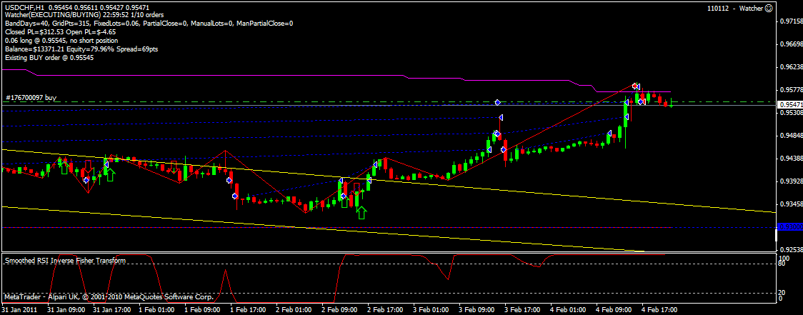
Player of the week award has to go to USDCHF, breaching its lifetime low and continuing downwards. I was ready to buy-in at 93c (plus a tad in case it didn't breach) and was a bit gob-smacked to see how far it went down. I managed to buy in again at the right point, and ended up late Friday with +30 pips. My original trade was up about +12 pips, so I decided to go to sleep and let it ride. Bit disappointed to wake up at 6am this morning to find it about the same number of pips underwater. You can see it almost reached my TP (the dashed lime green line) but there's no prize for that!

Tuesday 22 February 2011

110222 - Cloaking Devices and Photon Torpedoes ....

We often forget that there is a counterparty to every trade that we make. Exchange trading shields us from the risk we would otherwise have if the opposite side were to reneg on the contract, or otherwise be unable to fulfill it. Where there is no exchange involved, as in retail FX, our counterparty is usually our broker. Since all is (un)fair in taxation and war, often, like any other adversarial situation, the party with the most information, and therefore the most power, has the advantage.

When coding, I seek every advantage against my opponents, those elusive bugs, by having the highest level of compiler warning possible, following strict style guidelines and well-proven design techniques.

Why should we therefore give away any information to our adversaries when trading? We often forget that the other side has the power to, for example, momentarily jack prices (stop hunting) and to delay orders until a more favourable quote arrives from the liquidity provider. As we write software to give ourselves the best chance of making money, so our adversaries are also doing the same thing.
 
The counterparty has several vital pieces of information provided to them, by us, in every order that we send. These are price, volume, profit target, and stop loss.

It is difficult to perceive how price and volume can be used against us, or how we could avoid sending that information. However, consider a gridding application which always sends the orders at precisely one grid width with the same volume. Do you think that can be detected and the information extracted and used against us? Sure it can! Randomly varying (slightly) grid slot sizes and volumes (within the account balance boundary, difficult to do with $1000 ...) may give us an advantage, or at least reduce the other side's advantage.

Withholding profit targets and stop loss prices is feasible, and recommended. Stops can only be "hunted", and profit targets avoided, if they are known. Having your software continually monitor orders, and close them according to your own operating parameters, effectively removes more of the other side's weapons. Of course, if you operate over the internet, then you have a problem with disconnections and delays. Failure of your software or hardware (of which your connection mechanism is an integral part) leaves you exposed to unlimited downside if price moves against you. To combat this, you can employ hard, liberal stops, outside of your expected stop. There are of course those situations where your soft stops would not be hit due to price-gapping, but then neither would a server-side stop.

A final note about trade comments. If I were writing defensive software, I would scan all orders for comments. If I saw something like "Andy's Neural Network EA", I would consider it a challenge and consider adapting my software, especially if this EA became prolific and successful. On MT4, you can't comment a manual order. I wonder why?

Saturday 19 February 2011

110219 - The Week in Pictures

In my last post I talked about Harmonic Patterns. Unless you are a geometry enthusiast, or have a very good eye, using pattern recognition software for these empirical signals is essential. If your software can detect the patterns reasonably quickly and communicate those signals to your encompassing system, you are in for some potentially profitable trades.

AUDUSD showing recent Bullish 5-0 pattern
AUDUSD - A Bullish 5-0 pattern was indicated late last Wednesday. The 3day Linear Regression Channel Indicator shows the whole short-term trend so far. I also expanded the chart to show confirmation of the previous Bearish Gartley pattern detected on 19th January.

EURCHF showing Bearish 5-0 Pattern
EURCHF exhibited a Bearish 5-0 early afternoon of 6th January. This was later confirmed by the Smoothed RSI Inverse Fisher Transform Indicator, and made for a potentially very nice trade.
EURGBP continues sideways move
EURGBP was interesting from a gridding point of view this week. Volatility of this pair has decreased since set up, and the Watcher's grid setting is now probably a little too narrow. Whilst there are several good swings in the price, Watcher only managed to capture one of them, price continually bouncing just below one of the grid lines.
USDCAD bouncing of nDay low point
USDCAD again bounced off its nDay low point this week. As for the last 2 times this has happened, waiting until the open of the first bar following breach of the old low point presented the best opportunity.
USDCHF nearing all-time low

USDCHF again approaching its all-time low of 93c. Look for some good opportunities as it gets closer to this level.

Friday 18 February 2011

110118 - Float like a Butterfly, sting like a.... errr ... Crab? - Harmonic Patterns

Oooh Daddy, look at the beautiful butterflies ....
I have long been interested in harmonic patterns. The basic premise is that there are certain shapes in the price series which empirically suggest what will happen next. Whether or not you give this any credence or not, it is an interesting study, the by-product of which can be much valuable market insight.

Harmonic patterns are based on Fibonacci retracements, i.e determining where a "golden" ratio of peaks vs troughs exist, and buying/selling accordingly. Putting the numbers to one side (we will come to that in a moment), to me it is quite intuitive to say that a price may rise after it has made a significant fall (bullish signal), or fall after it has made a significant rise (bearish signal).
Gartley 222, named after page 222 of Gartley's book!
There are many websites that describe both harmonic patterns and Fibonacci ratios, so I will not repeat that work here. My favorite site is http://www.harmonictrader.com/price_patterns.htm
Whether or not you believe that Fibonacci numbers actually work, there are perhaps so many market participants who do, that it is a self-fulfilling prophecy, and that could be true of any such empirical signal. Imagine 25,000 harmonic pattern traders saying "OMG, there's a bearish bat formation, sell the farm ......".

One of the drawbacks with Harmonic Patterns, for many retail traders, is that to see a significant amount of patterns, you need a lower timeframe. If you study 4 hour charts, classic patterns except for Fibonacci retracements are few and far between, that is why most pattern indicators have a tolerance input, which you can increase to get more patterns. Of course, this potentially invalidates some signals. I think this explains the continuing amount of new patterns being invented, as the majority of retail FX traders don’t make trades based on H4 signals and then keep the trade on for a month. Probably due to boredom. My pattern indicator detects and displays:

AB=CD
Bat
Butterfly
Crab
Fibonacci Retracements
Gartley
5-0

Bearish AB=CD
You will observe many more Fibonacci retracements than full classic patterns. If you recall that ALL classic harmonic patterns have some Fibonacci retracement component, then that’s not surprising. By default, my indicator has Fibonacci retracements turned off. Not that I don’t think they are valid, merely because most people who are interested in the indicator want to see the larger patterns. Of course you can reverse this, and just trade the Fibos alone.

The majority of commercial indicators are repainting, and use a method of determining retracements which means they miss the trade entry by a considerable margin. They do not include easily accessible signal buffers.

You can tell that these indicators have been written by very clever individuals, given the amount of signals and measurements produced. Do users really want to see the results in a zillion different muddy colours, or would they rather understand that the patterns are displayed on a colour cycle that is easy on the eye when the user is staring at the screen for 8 hours? Does the indicator perform well in real-time? Try setting your favourite pattern indicator to have a 10,000 bar history, and attach it to an EA in the strategy tester. In visual mode, move the speed control to the extreme right (fastest). Does it keep up or does it stutter with the load? This is a measure of  “On-Off” ratio and shows how much of your system resources the indicator will use. In the same test, does it give multiple signals at slightly different bars on each bar open? That is the difference between writing code and production engineering.

Bearish 5-0
For most types of trading, stops and profit targets are the key to successful trades. When the indicator gives you a valid bullish signal, you still need to know how big your stop should be and where your profit target is. There is a whole other layer that needs to be put on top of this or any other indicator to achieve that automatically.

Saturday 12 February 2011

110212 - The Week in Pictures

This week I have used my new channel indicator to show the 5 and 3 day channels for each pair.


AUDJPY continues its sideways move. I normally don't like selling AUD due to the negative swap, but re-enabled it recently to gain advantage from the return to sideways move, and possible downturn.


AUDUSD has now finally moved below my nDay centre point, and Watcher has initiated some buy orders. This should accumulate some nice swap, as well as giving us the benefit from the sideways move which should come as this pair moves away from its lifetime highs. See the reversal which occurred in the latter half of Friday. This shows resistance to the downtrend, with support at around 99.6. If this is broken, I expect the next support level to be at around 99.5, also a psychological level.


Weakness in the Swiss Franc (and GBP strength) has been apparent for the last 2 weeks, and Watcher sell trades are accumulating. Comparison between 5 and 3 day channels shows the uptrend may be flattening ready for a reversal.


EURGBP shows possible weakening of GBP, though not as much as could be expected following the recent BOE decision to keep rates unchanged for the next month. Sterling strength, given conflicting fundamentals and the BOE decision, remains enigmatic.


EURJPY shows some signs of easing, possible sideways move starting.


EURUSD has been moving sideways for a while, channel indicators show either increasing volatility or the start of a downwards move. Late Friday trend as shown by the Smoothed RSI Inverse Fisher Transform indicator (must think of a new name for that one!) is, however, interesting.


GBPCHF remains the pair of interest, it being difficult (for me) to understand. Good fundamentals for the Franc, overall bad fundamentals for sterling, the BOE interest rate decision, all just don't add up. The 3 day channel looks like it is confirming the 5 day channel continued upward trend.


GBPJPY continues its upward trend, possibly even increasing in strength following BOE decision.


USDCAD now firmly resisting any attempt to pull it above its nDay mid point.


USDCHF in increasing uptrend.


USDJPY in increasingly steeper uptrend.

110212 - Getting the Picture: Constructing Channels

Drawing simple line indications on your charts can be extremely useful to show exactly what the trend is doing, and whether or not volatility is increasing or decreasing. The easiest way to visualize these important measures is by use of triangles and channels. However, there are many ways to draw even a simple triangle, and each method will yield slightly different results. This is also true of channels: What number of bars do you use? Where do you place the first line? How do you position the second line with respect to the first?

I like to think of a channel as "the range in which prices move over the specified period, bounded by the maximum and minimum deviation from some typical price". From this definition, we can start to get more scientific. Looking for a better way to express this "typical price", I looked at many existing indicators. Of those which approximated what I wanted to see, the majority involved a linear regression calculation to deduce the centre line from which the outer channels are then calculated. The corresponding measure of fit, R-Squared, can also be calculated very cheaply along the way, and displayed if required, in order to assure the viewer that the end result does indeed match the time series.

Once the chosen regression method is understood, it can be coded very simply and efficiently. Personally, I would not want to have these calculations proliferate through my code and be executed on a tick-by-tick basis since they can be compute-intensive, so i made a decision that I would only want to visualize any change at each new bar open. Writing the regression code as a libraray function makes it available for reuse any time I need it, and also, as time goes by and it gets used for more applications, I can be confident that the code is mature and stable. Conversely, some thought needs to be applied to the design, such that perceived future modifications are minimized, reducing the risk that the behavior of dependent code is affected.

At this point, I deviated from the other indicators, after determining that none of them did really what I wanted. I wanted  a channel that "hugged" the prices, the upper boundary touching the high of the bar with the greatest deviation from the centre, and the lower boundary touching the low of the bar with the greatest deviation from the centre. Once the boundaries have been determined, optionally drawing the line which is at the centre of those two limits naturally reveals a difference from the original regression line. I have not found this to be significant, and the final result is exactly what i wanted.


The above chart picture shows EURGBP on the H1 timeframe. I have added 2 instances of the regression channel indicator. The channel drawn with solid yellow lines is the 5 day channel, and the broken yellow lines show the 3 day channel. I have found these 2 periods to be of interest., and will use them in future. Note how they both "hug" the channel nicely. I am not showing the optional centre line, nor one additional feature that I found useful in Expert Advisor testing: drawing the trail. This option leaves a mark at the oldest centre point before the channel is redrawn upon start of the new bar.

If you are interested in obtaining a copy of this indicator, please contact me.

Thursday 10 February 2011

110210 - Sylvain to the rescue

After using the Smooth RSI Inverse Fisher Transform Indicator for the last week or so, I noticed some odd behaviour. In particular, the turns were not what I would expect, being a little shallow and slow.

Looking back at the original article in the October 2010 edition of Technical Analysis of Stocks and Commodities magazine, I noticed references to two stock price series, CSX and Starwood Hotels. I quickly downloaded the Starwood Hotels 2005 data from Yahoo!, but results were inconclusive. The price series was not the same as the one shown in the magazine. 
I noticed that the author's email was thoughtfully included at the end of the article, and so fired off a request to ask him to verify the source of the data. Imagine my surprise and delight when, within 24 hours, I not only received a polite response from Mr Vervoort, but he also attached a copy of the exact data file he had used for his article!

Plugging this into my Excel model quickly revealed a subtle bug. I then loaded the same data file into the MetaTrader history centre, and confirmed the exact same results Sylvain had presented in his article. This proved to me that a) you can't do enough testing, and b) there are some very nice obliging people in the industry. See below the figure from the original article, my Excel chart, and the corresponding MetaTrader chart.


The figure from the original article


Sylvain's data file applied to my Excel model


The final result on the MetaTrader chart

Sunday 6 February 2011

The Week in Pictures

Each week (or until I get bored) I would like to share with you my take on the major currency pairs, and attempt to explain in simple terms what I think happened. I will leave the "why" up to someone with a higher qualification in cognitive psychology.


EURCHF is moving sideways, trading within the 270 pip channel (yellow horizontal lines) which it entered on Jan 13th, and shows no sign of breaking out.


EURGBP is trending down, trading within the 85 pip channel established on 21 Jan, again no sign of breaking away from this.


EURUSD broke out from its uptrend on 3rd Feb, and is now roughly back where it started its lauded appreciation on 31st Jan at 1.3580. Personally I was expecting the trend to continue for a little while longer, and had already battened-down Watcher to a maximum 10 trades per pair, and was looking forward to a possible situation where I may need to prune off some of the older trades. Again, it reinforces some of my theories (particularly the theory where I state most theories are bunkum) about the balance between the pairs and the fact that this is indeed a zero-sum game (unless of course you are a broker :).


GBPCHF is still going strong on the uptrend established 25th Jan, with no signs of running out of steam.


GBPJPY volatility has been decreasing since 28th Jan, and broke out of it's consolidation phase right on queue on 3rd Feb. It now appears to be moving sideways after some violent moves typical of this pair.


GBPUSD has increased in volatility this week, and looking to break out of the 265 pip channel established on 25th Jan. (The gaps in the trades that Watcher has established are due to the use of stop orders. Since it contra-trends, if the trend away from the mid-point is violent enough, these orders do not get executed, saving margin and number of out-of-the-money orders. These grid-points will be used again when (!) price retraces.


USDCAD remains in the 110 pip channel down-trend established 31st Jan, touching a new n-day low point on Friday. This is usually an opportunity for a big manual trade to catch the retrace, but lately I'm just monitoring the "native" performance of Watcher, and comparing what happens with signals given by both the swing indicator and the Smoothed RSI Inverse Fisher Transform. This new intermediate low is still a long way off its lifetime low so I'm not looking for any further big moves down.


USDCHF however, remains close to the lifetime low of 93 cents that it touched on 31st Dec last year, and provides manual opportunities each time it approaches that level. The latest encroachment ended on 2nd Feb, with the swing trading indicator clearly catching ALL of the resultant up-trend. Note the final level for the week was near to the n-day mid point.


USDJPY broker out of the 100 pip downtrend, established 27 Jan, on Friday. Next resistance level seems to be around 83.2 which will cross over the n-day midpoint, and start Watcher selling again.


Thursday 3 February 2011

The Market Breathes - Explaining Market Behaviour

I liken the market to a living entity. This is, I believe, justified even if only to make useful analogies to try to explain its behavior.
 
Consider the market as a mentally unstable person. They have mood swings, they may or may not be violent, they may or may not appear “normal”. One day they may make you a cup of tea, the next they may set fire to your dog. Given enough data, you can always figure out what the trigger WAS for a particular behavior, but predicting from that information relies on a LOT of experience and gut instinct. Does that explain why experienced manual traders consistently make money using MACD etc? I think so!

Any time series analysis is just that, ANALYSIS. The best you can do in the technical sphere is to use indicators to see where price action MIGHT go. Doesn’t mean it’s going to go there! Of course, there are modern indicators which give fast and accurate signals, it's a matter of time to see whether or not we will have any "Smoothed RSI Inverse Fisher Transform millionaires".

The market breathes, price moving first one way, and then the other. Most trading decisions require entry time, direction and volume. The conservative trader also demands a stop loss price, and perhaps also a profit target. It is advantageous in any problem-solving situation to be able to reduce the unknown parameters. How much easier the trader's life would be, for instance, if they only had to concern themselves with only one or two of these.

Look out for my upcoming article on "Watcher", my grid-trading expert advisor (EA) for the Metatrader4 platform.

Wednesday 2 February 2011

Smoothed RSI Inverse Fisher Transform indicator for MetaTrader

As featured in the October 2010 edition of Technical Analysis of Stocks and Commodities magazine, this indicator provides (very) fast and accurate switching in order to present possible trading opportunities at the instant  they become apparent. The indicator is based on a smoothed RSI, which is then passed through a zero-lag exponential moving average, before being adjusted by the inverse Fisher transform. For more details on the algorithm used, you can refer to the Technical Analysis Of Stocks and Commodities Magazine.

If you are interested in buying the indicator for the MetaTrader platform, please contact me