Thursday, 14 November 2013

Andrews Median Lines

Alan Andrews is famous for teaching traders about median lines. The most popular configuration available on modern charting packages is the Andrews Pitchfork, an attempt to project price and time forward from known price turning points (pivots). In most implementations, one selects 3 alternating high/low pivot points (either low/high/low or high/low/high), and the charting package draws the pitchfork as follows:

1. Draw a line (the median line) from the first point through the midpoint of 
the second two points.
2. Draw a line parallel to the median line that passes through the second 
point.
3. Draw a line parallel to the median line that passes through the third 
point.


Andrews stated there is a high probability that:
Price will return to the median line 80% of the time after the third pivot is made.
Price will either reverse on meeting the median line or gap through it (he used daily stock charts, so a common modern interpretation is if the price moves quickly though the median line rather than gap across it).
When price passes through the median line, price will pull back to it (i.e. the median line acts as a price attractor).
If the price fails to reach the median line, it will move in the opposite direction for a greater distance than that which it missed the median line by.
Price reverses at any median line or extension of a prior median line. 

Inside lines

Price can be expected to stay within the confines of a pitchfork. Sometimes the pitchfork drawn can be large, and price projection is more easily found when additional lines are drawn within the median parallels.


Warning lines

When price falls outside the pitchfork, the pitchfork is considered to have "failed". Price may, however, return to the pitchfork at a later time. Price may respect lines drawn outside of, but parallel to the original median line, at spacing equal to the distance between the median line and one of the median line parallels drawn from point 2 or point 3.


Schiff

Andrews encouraged his students to contribute towards the technique. One of these was a trader named Jerome Schiff. He proposed that, when price does not follow the traditional pitchfork implementation, it may follow a modified arrangement where the start point of the median line is taken to be half way between the first and second pivots.

50% Pitchfork

Another variant, attributed to the Austin Financial Group [1] alters the first price to be the same as the third price.


Trigger (Hagopian) lines

Another student, Hagopian, suggested that, if price crossed either a line drawn from point 1 to point 2, or crossed a line drawn from point 1 to point 3, that this indicated a price failure and that a trade may be taken in the direction of the failure.


Mini Pitchfork

Andrews often drew pitchforks using alternate daily closing prices. These are referred to as "Mini Pitchforks". In this case, prices are aligned to the closing prices and not high/low prices.


Implementation

The FPS Pitchfork tool for MetaTrader4 supports:

1. The original Andrews pitchfork.
2. The Schiff pitchfork.
3. The 50% pitchfork.
4. The Mini pitchfork.
5. All of the pitchfork variants may have hagopian (trigger) lines, inside lines and trigger lines added by manually modifying the object description.

The tool is implemented as a script, which I have linked to a hotkey, so that it is called each time I press CTRL-F. Some other pitchfork tools are implemented as indicators. The indicator has 2 drawbacks. Firstly, you cant use it easily on a weekend, since redrawing is only done when quotes arrive. Secondly, they consume CPU on every quote, even if they decide they don't have any useful processing to do. Since I run 153 bots at the same time, this ends up being a significant factor.

The user draws a pitchfork using the Metatrader tool, then optionally modifies the object description to contain pitchfork type and lines required. The script then uses the object description information to both align the pitchfork and to draw the necessary ancillary lines.

Recommended reading (and recommended order)

1. Fisher, Greg - Using Median Lines as a Trading Tool.
2. Mikula, Patrick - The Best Trendline Methods of Alan Andrews.
3. Morge, Timothy - Trading With Median Lines.

Sunday, 25 August 2013

Multiple Renko Charts in one Metatrader with no extra "Ticking" software

One of the issues encountered when using Renko inside of Metatrader is the fact that the refresh signal sent (PostMessage) by the generator is consumed by the first chart receiving it. In order to overcome this problem, the generator needs to be modified to recreate the offline chart (.HST) in a continuous loop. In the following example, a proprietary generator is used to produce BOTH a EURUSD and a GBPUSD chart within the same instance. Any EA attached to the charts needs to employ techniques to detect "Aged Quotes". These occur as the generator causes them to be ticked on each throttled cycle, but also occur in real-life after weekend server switch-offs.


Saturday, 6 July 2013

Are Fibonacci numbers important?

I have 68 bots running currently, none of which use Fibonacci numbers. Now that's not to say that they are not possible future inflection points ...

Which they are. Its easy to attribute cause to Fibonacci ratios, merely because they are a self-fulfilling argument, i.e. if a Brazilian people (the number of people it would take to fill Brazil) traded a currency pair using Fibonacci numbers, then their actions would mean that they would influence the price with their supply and demand. same goes for round numbers (e.g. cable support at 1.5000) which are psychological support/resistance numbers.

Consider the action of major banks. No desk head says "sell at 1.49372", rather they say sell at one and a half (1.5000). Junior traders responsible for bulk execution will set their limit/stop orders to exactly 1.5000, hence these become important numbers.

If you watch a gold tick chart, you will clearly see the "magic" numbers.

Monday, 1 July 2013

10 Reasons why back-testing is pointless

I am always interested in why my endeavours fail, but i usually try to do something about it. Often the knowledge so gained sets me upon a different, hopefully profitable path.

Recently, one of my bots had some issues which made me decide to use "better data" for my backtesting and optimisation. The following is a bullet-point list of the results.

1. You are not using your own broker's live server data:
- It comes from a different broker than the one on which you will forward test, and so
will almost certainly have (even slightly) different prices from that which you would have experienced had you been connected to your broker's platform. Prices differ also between demo and live, and between historic timeframe data (*see footnote*)

2. You are using your own broker's (tick) data, but the copy that you have is not complete and/or accurate:
- This would probably be the most accurate way to test a bot, but relies on you receiving/recording every tick in a timely fashion. This may not be possible due to net latency.

3. You have filtered out duplicate ticks
- Duplicate ticks may have an effect on your bot.

4. You are using a constant spread:
- Spreads are usually only constant when the market is closed.

5. You are using a constant tick value:
- Tick values are sometimes not constant, e.g. when trading a cross pair.

6. Your bot behaves differently in live than in optimisation/testing mode:
- Some platforms provide a way of the software determining if it is "test" mode, e.g. the IsOptimisation() and IsTesting() Metatrader functions. These allow you to legitimately bypass unwanted code (e.g. some console output) but may also cause other side effects.

7. You assume market memory where there is none.
- If the random-walk theory is correct (not my opinion), then technical analysis of any kind is useless.

8. Your bot is over-tuned (curve-fitted) to the price data:
- Some analysts insist a bot must have been back-tested using many years of data, and is only "useful" if it would have been consistently profitable over that period.

9. Your bot is under-tuned (not curve-fitted) to the price data:
- Some analysts believe that regular tuning is necessary to allow the bot to "keep in step" with the changing data distribution.

10. You can't keep your fingers off the finished product:
- OK, so you got 1 to 9 under control, and then put your "holy grail" onto a live account. The bot enters a trade, and it is making money so you just HAVE to close it at a profit, thus ignoring a sound tenet "Let your winners run", and losing 50% of the profit you would have otherwise made (opportunity cost). The bot then enters a trade, and it is losing money, so you "Cut your losing trades short". The second you close your trade, the price action reverses and you lose what would have been a healthy profit. YOU MUPPET!

Saturday, 12 January 2013


A Happy New Year to all clients and friends. I haven't made any updates for a while (I hope 2013 is as busy as 2012!), so to make up I will try to detail some of the behavior that I think every trader (and financial services developer) should consider.


Frame dependence

Frame Dependence is the tendency to evaluate current decisions within the framework in which they have been presented. Look at the screenshot of recent activity of EURUSD on one of my robots. See the long rally which halts, then continues upwards. This presents a frame-dependent choice. One can either decide, "Yes, that's a significant enough rally, I will take profit here", or decide "Nope, let the profits run, I can always exit if it doesn't work out". What is really going on here is how one perceives the trade profit. The thought "Its not mine until it's booked" may lead to "It's only winnings so it's not a problem if I lose it". Account equity becomes account balance only if you have no open winning or losing trades. Frame dependence includes loss aversion ("I don't want to lose my winnings so I'll book them at this level") and hedonic editing ("Wow! If I book now I've made $$$!").

Money illusion (a 2% payrise with 4% inflation is better than a 2% pay cut) also comes into play when trading costs (swap,commission,spread and slippage) are not considered. This further leads one to believe more profit is being captured than actually is. In the screenshot, notice the robot takes the profit, then enters again. As it wins both times, "happy days!", but staying in the trade would have halved the trading costs, plus also of course gaining the difference between the exit of the first trade and the entry of the second.


The final statement of the last paragraph can be considered to be made as a result of hindsight. We knew the trades had already been made, we knew the outcome, so we can bemoan the losses incurred, or celebrate the successes. In a manual trading situation, having observed this outcome, if we weigh on the side of "cup half full", we would do the same thing as the robot has done here, and book profit in a similar fashion. If we come down on the "cup half empty" side, we may let the trade run, in the hope of gaining the lost costs. So hindsight may give us a bias for what we do in the future.


In scientific experiments, one posits a theory, describes the event or existence of something that would prove the hypothesis, then actively looks for that event or object. If found, the hypothesis is proven, if not, it is not proven.

Confirmation bias is the tendency of people to favor information that confirms their hypotheses. Having observed the events described above, one could look backwards for similar events where 2 such trade events occurred. Seeing the event again could lead one to believe either that the cup was half empty or full.

Sunday, 15 January 2012

120115 - Watcher Update


At the risk of having a margin call that will completely ruin my mood, I have decided to post here my latest Watcher version results.

Watcher is my grid trading robot, built on the Metatrader4 platform. For the last 2 weeks, I have been trading it live with results that match the back-testing.

As of Friday afternoon Watcher is up +42%, and I am out of the market totally until Tuesday morning, or possibly NY session on Monday if I get back early enough from my current trip. The reason for taking a break is uncertain market direction from here. Futures open interest shows large speculators very short, the usual signal that precedes a rally. 

On a side note, my DR backup server is having some problems. I am using TeamViewer7 to control it remotely, and have some issues with logging in after reboots. This trip to deepest, darkest Quezon province has provided an excellent opportunity for me to shake this out.

I have been doing a LOT of reading this weekend, and have some great ideas on how to formulate a method for evaluating grid trading systems. This will allow me to perform significantly quicker testing for any new features. I am very keen on spreadsheet modelling, and this method will allow me to evaluate new techniques before coding.

My live experience is matching exactly with the forecast, though I am only shooting for 50% of forecast. Alpha-adding moves have added about 20% to the PL. On friday, when the fall started, I moved from a 20 pip to a 10 pip grid, and doubled my take profit to 20 pips. Then I just watched it fall.When I was down to the final 2 open trades, I switched Watcher off. As the price reached the trough, my last trade closed, and I was out of the market with +42% for the 2 weeks.

Now I am sure there are bruises to come, but manipulating the parameters on this version is way better than last time i tried this, so I will move to automating the main parameters, possibly running them from global variables again, rather than risk going through the EA inputs and screwing it up. Another thing I have done is to have a script to modify all existing TPs, so I can increase them independently of the EA.

I need also to do some tweaking on the prices at which I place pending orders, making them exact multiples of the grid width, and so avoiding the few situations where I end up with a couple of trades a few pips apart, which is inefficient.

Sunday, 1 January 2012

Kaufman Adaptive Moving Average Binary Wave

This new addition to the products line gives fast switching to easily detect trading opportunities. For more details on the algorithm, see Perry Kaufman's Smarter Trading - Improving Performance in Changing markets.

In addition to the binary signal line (solid), the indicator also shows the trend efficiency ratio, a measure of the noisiness of the price series. Close to zero is noisy, close to 1 is trending.


Saturday, 24 December 2011

How to make 100% in 4 weeks whilst risking your house ...

On Friday afternoon Manila time, Watcher reached 100% over its November 21st starting balance. Market has been characterized by unverifiable news (rumour) causing it to briefly kick up, then to settle back down to its support level around 1.30. This is also a major psychological level. From here, there is up and there is the June 2010 level of around 1.20, then quickly down to September 2001 levels of 0.85. Scary! news of good Spanish bond sales bely the fact that Spain cannot repay its debts, there just simply isn't the margin in its budget. An interesting comparison of national debt per capita shows the US in a surprisingly strong position over the majority of European nations.


On another note, HSBC moots AUD falling to 0.93c from its current parity level, so that's another medium to long opportunity to watch out for.

Monday, 19 December 2011

How to make 85% in 3 weeks whilst risking your house ...


EURUSD price action has been very predictable over the last week. I predicted the drop to 1.302 (roughly where it is at time of writing) on the 13th, and can now see the "faux" moves the market makes(paticularly in NY session) again and again.

Trading grid is easy, but it has one big drawback. If the trend goes against you, you will lose your shirt. I have added many features to Watcher to help prevent this, but the major change has been moving from a microtrend logic to trying to follow the "major" trend. Placing pending orders when the price is further from the grid point also helps to avoid them triggering soon after placement.Its that simple.

Over on StockTwits, I also receive some great insight and tips from other traders. Kudos to @JuanLobato for his recognition of the bearish EURUSD M1 triple top. Seems obvious in hindsight, but while others are looking to the esoteric, Juan was the only one to tweet this:


StockTwits is invaluable for determining "why did it do that" as news comes in a very timely fashion


Finally, an extract from the broker report last week. I show this to demonstrate the significant pattern of ratcheting Watcher has made since trading of this version began. Watcher is (at time of writing) at 85.76% profit since 12st November.


Happy holidays to all!

Sunday, 11 December 2011

111211 - Week In Pictures

Watcher, my grid trading program, continues to survive the markets after 3 weeks of trading. The account now stands at $7560 (equity) showing a net profit of 51.2% since Nov 21st. Balance is at $8110, with open PL (usually negative given the nature of the app) at $(550). Free margin is at 1260%, with 150:1 leverage. The EA has complete control, closing all open positions when a certain percentage increase of equity has been achieved. Experience is showing that it is giving away some potential profit, as price continues in a favorable direction, but this is not always guaranteed, since the killer price action for grid trading is a low-volataility move away from the trend which the app is trying to follow.


From the fundamentals side, the short-only strategy for EURUSD has been a bit of a no-brainer. Global bank coordination to increase liquidity has had no effect on the pair, and this weeks meeting of European finance ministers failing to agree on anything that will solve the debt crisis in the short to medium term only serves to increase concerns regarding the future of the EURO.

There was a false breakout of the (slightly bearish) triangle of consolidation on the 9th which set the limits of the European session.

False Breakout

From the technical side, my studies of support and resistance around both price and volume see key turning pivots at the 1.345 and 1.328 point. I found the heat maps I was using last week to be a bit garish for day-to-day viewing, so have removed the colors and just marked the lines of significant change.


In order to monitor the trend, I use daily, weekly and monthly long-range charts:


Sunday, 4 December 2011

111204 - The Week In Pictures

After being up 22% on the week last week with the new version of Watcher, it was only to be expected that this week would be less, possibly even finishing with account equity being lower, as we accumulate more losing positions.
 
On Wednesday central banks coordinated to reduce cost of liquidity swaps by 50 basis points. However, the
Euribor-OIS 3-month spread, the rate at which Euro-zone banks lend unsecured funds to one another, closed at its yearly high. "For context, the last time the Euribor-OIS 3-month spread was this elevated and in an uptrend was in September 2008, right after Lehman Brothers went under".

US Non-farm payroll numbers turned out slightly positive, but the end of the week dollar rally (at expense of the Euro) was probably due to long positions being closed prior to the weekend. Hardly surprising given the 100 pip gap at the week's open (though this was a positive gap). With the Euro debt situation worsening (though see here) it seems like the market doesn't know which way to go.


Watcher closed a significant number of trades both at mid-week and at the close, finishing up an additional 12% (now 34% for the 2 weeks). Drawdown towards the 500% margin level was experienced, but this level was not breached. At one point, only 7 trades were opened, down from the week maximum of 17. Losing positions are less than 10% of equity at the close.

Looking at the heatmap, this is showing a shift in zones to a higher level (1.345 to 1.354) from the previous zone (1.328 to 1.34), with price now resting at the top of the original zone, as per my Wednesday prediction on StockTwits.


The long term view as shown by weekly chart (support lines in Green, Resistance lines in Red) is still negative.

Saturday, 26 November 2011

111126 - The Week in Pictures

The end of the Euro?

Betting down the Euro has been a pretty safe bet this week. On Friday last, I predicted a fall in the EURUSD from 1.34 to 1.32. Looking at the chart, the support/resistance lines are clear, 1.34,1.32 (strangely not a big support at the round number at 1.33),1.29, 1.26 and then straight down to 1.19.

The main issues of when and how to take the trade are moot if one uses a grid trading program. An updated version of Watcher, my MT4 grid-trading app, can be configured to trade uni-directionally, and "ratchet" in profits when net asset value (NAV) exceeds the starting balance by a user-configurable percentage.Switching off long trades, and using a ratchet of +3.5% resulted in a remarkable profit of 22% on the week.

The new Watcher version again uses my proprietary trading libraries, snippets of which I have shared and reused time and time again.

Check out the screen print below for more details:

Wednesday, 9 November 2011

Now that really ticks me off (Why testing with tick data can be 99% wrong!)

Dontcha just hate it when you spend the weekend back-testing your latest software, only to get disappointing results when you forward test the next week. Where did I go wrong? How can this be happening?

One often mooted reason is the data used for the back-test. If the data is not representative of the live environment, our test results are not likely to be reflecting anything near reality.

Of course, there is the argument that back-testing is intrinsically useless because the future does not reflect the past. Well, a brazillion (large number) folks would disagree. I include among those any trader that uses a support or resistance point, Fibonacci projection or similar in their strategy. What else do these demonstrate but market memory? I digress ...

The list of problems with data includes:

Difference between demo and live: Even if you recorded tick data yourself from a demo server, it may not reflect what is happening on the same broker's live server. Big and frequent differences point to the need to look for a new broker.

Data not reflecting "market" liquidity provider sentiment: Foreign Exchange is a huge market. Retail brokers only have a (usually small) slice. Their quotes will reflect that small share, plus their own spreads to reflect their trading position (after all the majority are actively trading against you). I don't want to reiterate the list of broker "dirty tricks" in this article. Dump a months worth of M1 data, come back a month later and look at the historic data currently shown. You will often find peaks/troughs disappear. These are artificially jacked quotes designed to knockout trade stop losses.

Data gaps: Wow! look at that hugely profitable renko trade! Unfortunately the untradeable stream of bricks produced by my chart generator were entirely due to the gaps in the data I used.

Data granularity: Using 1 minute closes to test a scalping system may not be the optimal method, especially if your system artificially generates ticks based on the Open, High, Low and Close of that bar. Metatrader, for example, uses a technique called fractal interpolation to generate fake ticks from the summary bar data.

Data obtained from a different broker: It goes without saying that testing with data from a different broker has its problems, results depending entirely on the correlation between them and prices from the target broker.

Applications requiring volume as a key parameter: Some providers dont provide volume at all with their data (e.g. Gain Capital). Some provide bid and ask volume separately (e.g. Dukascopy). It is questionable in many cases whether the volume numbers are representative of anything.

It's all in the percentages

Bwa ha ha ha! Sorry, let me pick myself up from the floor and dust myself off. There is sooooo much BS talked about 99% vs 25% tick data that I have to expose this right away. I refer to the test summary report MT4 produces when doing back-testing. If you use fractal interpolation, the percentage will be low, like 20 to 25%, right? But if you have tested with good quality data, the percentage will be high, like 99%, right? WRONG! The 25% figure is a number that the strategy tester in MT4 writes into the tick data file. The 99% figure is a number that the PROGRAM that generated the data writes into the tick data file. Simple as that. In version 406 of MT4, it is a double value written to  bytes 232 to 239 of the file. Any reprobate could fake the "quality" of data used in their testing using a very simple program.

Warning note: MT4 tick data DOES change sometimes from build to build. Please ensure you are using tick data generated for your build, especially if you purchase it.

Solution

There are several solutions to the issues mentioned above, and whichever you take will depend on the type of testing you want to do, whether you are scalping or working on longer time-frames, using time-based or price-based charts.

Some very nice scripts are freely available for downloading, and given time, one can become very proficient at using them. One problem for me is that they usually run very slowly, very frustrating for me if I want to generate a tick data set for several currencies and time-frames on the fly. Being time-conscious, I had to bite the bullet and spend some time, firstly deciding what approach suited me, and then implementing a system. The beauty of porting to a more modern environment such as VB/Java/C++ allows me, as a programmer, to revisit all of the programmer decisions that must have been made multiple times by the various implementers. e.g. Once you move out of MQL4, you need to implement your own StrToTime function, which is fun! As I mentioned previously, quick access to representative source data is important to me, so using Dukascopy with its wacky interface is largely out of the question. My choice of data provider allows me to download in bulk, on the fly, in a matter of minutes. My new system allows me to quickly convert this into a tick data file with 99% quality (or is it 100%?), (big smile .....). BTW, did I mention it can also generate renko tick data?

Monday, 3 October 2011

Expert Advisor development process

PT1 - The donkey work, formulating the manual strategy.


   The expectation of what a forex robot, or Expert Advisor, will do largely depends on the experience of the individual using it. If you feel that an EA is appropriate to trade your strategy, then you will have a better chance of success. If you have not traded the strategy manually, then you are at best guessing as to the probability of its potential success or failure.

   It is useful to follow the thought process behind a strategy, test it out manually and then see whether or not it would be advantageous to create an automatic system.

   I wrote the following article in order to describe the full development process with the following major steps:

1. Identifying the opportunity
2. Calculating entry and exit points
3. Money management

   The pictures I display were created using indicators that I have developed for my own purposes. Though I am a commercial developer, I explain exactly how the same results can be obtained for free.

Identifying the opportunity

   For the example strategy, I have chosen a simple mean reversion system. In one shape or another, mean reversion forms the basis of the majority of systems seeking to profit from currency moves (and also those systems that profit from prices that stagnate!). So let me first explain in simple terms what mean reversion is:

   There is a tendency for a price series to follow a general trend. Within that general trend, there will be minor trends. The tendency for the price to follow the general trend, whilst exhibiting minor variations, is called mean reversion. More technical/official explanations can be found here and here. Note that the first link (a more mathematical treatise) provides a clue as to how we will formulate our strategy ("regression to the mean").

   If prices regress to the mean price, then, if we measure the distance a price is from its recent mean, we can calculate the potential profit we could achieve if we took a trade right now, and, following our trade entry, the price nicely reverted to its mean price. In order to identify the opportunity, we would need only to look at a currency pair, and see how far, right now, the price is distant from its mean.

   We can calculate the mean (over our chosen time period), and then apply some simple arithmetic. If the price is above the mean this would indicate a possible future tendency for the price to fall. If the price is below the mean, this would indicate a possible future tendency for the price to increase. The distance between the price and the mean shows us the potential profit.

   Although I can't claim to have seen and/or used all the commercially available trading platforms, I would make a (small) bet that all of them have the capability to display moving averages. A simple moving average is suitable for our purposes. Since we are going to be testing this strategy manually, I have chosen to use a daily timeframe, set up the trade, and then come back the next day to see if I need to make any adjustments.

   In the following diagram, I show a recent daily EURUSD chart with a 20 period (one trading month) simple moving average. This is entirely suitable for our purposes and we could stop here and trade the signals so generated as they have been traded since the 1970s (despite it statistically NOT being a causal phenomenon!).

EURUSD1 with SMA(20)
   I think there is a better way; remembering the clue we had before in the mean reversion definition, it is also possible to use a different mechanism for this type of trading. I refer to linear regression. Linear regression is a way of finding the "straightest line between 2 points". Choose the mid of a bar at the beginning of a period, the mid of a bar at the end of a period, draw a line between them and you have roughly what we need (again, for a more in depth perspective, see here and here. Unlike the simple moving average, this can filter out some of the minor moves that occur in the chosen period (i.e. the simple moving average will be irregular, the regression line will be straight - linear). We can see how far off the mean the price moves, allowing us to weigh up exactly which currencies are currently suitable for us to trade. If the regression line slopes upwards (trend for the period is up), and the price is currently below the mean, this provides the setup for a long trade. If the regression line slopes downwards (trend for the period is down), and the price is above the mean, this would indicate the possibility of taking a short position.

   If we add a fixed amount to each side of the regression line and draw two more lines, we can more clearly see what and where the minor trend is, and predict more clearly where it could go next. If we see the price bouncing along a fixed "regression channel", we might conclude that, if the price is just below the upper line, a downwards reversal is imminent. The next picture shows the Metatrader4 built in Linear regression channel indicator. The picture after that shows an adapted channel indicator, which moves out the upper and lower lines so that they just touch the current maximum highs and lows of all the bars in the channel. This allows us to see more clearly which bars defined the limits of the actual channel, rather than the usual regression plus average daily range that MT4 gives us.


EURUSD1 with Linear Regression channel, take profit and stop loss
EURUSD1 with adjusted Linear Regression channel, take profit and stop loss
 Calculating entry and exit points

   An obvious entry point is entry at market when we identify the opportunity. We have a choice of take profit points. We could exit once the price crosses the regression line (reversion to the mean will have completed), exit half the position in anticpation of a further move, or add to our position on a definite cross of the centre line. For illustration purposes, I choose the easier (and nearer point of the regression line). Drawing a horizontal line and noting the price where where the regression line is on the last bar gives us our take profit (TP) point. For stop loss (SL), if the price moves outside the near channel boundary, then we have a breakout of the channel and our directional bet is jeopardised. Other possible SL points are at the high/low of the previous bar, or high/low of a bar at some point in the period where we think we won't get stopped out unnecessarily.We draw another horizontal line and note the price at that point.


Money management

"I spent almost all of my money on women and alcohol, the rest I just wasted - George Best"

   We have all the information we need to make the trade, except how much do we bet? I created a simple blotter (trade list) in Excel, and created a formula for calculating the volume as follows:

=MAX(MIN_LOT,(RiskPC*Balance)/(ABS(OpenPrice-StopLoss)/TickSize*TickValue))

   I use a percentage of my balance, and divide this by the maximum adverse price deviation I will allow, and then divide again by the pip cost. We now have the volume, stop loss, take profit, and can now take the trade.

   I also use this blotter to document my thinking behind each trade, and the result, so I don't make the same stupid mistake twice!

Below are some actual trades. I display the ADX(2) in each one to confirm my understanding of the trend strength.


CHFJPY with LRC (19) to eliminate outlier candle
GBPJPY with LRC(20) and Opportunity Indicator (See part2)
USDCHF with LRC(19) eliminating outlier candle


PT2 - Automating the process.

In PT2, I will be describing how to identify the trading opportunities for every available currency pair, and outlining the EA design.

Thursday, 4 August 2011

Home, home on the Renko ....

EURUSD M1 Chart with Renko Bricks
In the following discussion, some of the points I make refer to the majority of Renko chart implementations made, including my own, using the Metatrader 4 platform. In some other systems, some of the limitations I describe in the caveats section CAN be overcome.

Caveat emptor!

Possibly the best (though in my opinion still not complete) description of Renko bars can be found in a (small) chapter of "Beyond Candlesticks" by Steve Nison. Renko (the name is thought to be from the Japanese word for bricks - Renga) charts show price movement away from a point, the bricks being drawn only when a certain price move has been made, not merely documenting the price change after a fixed time period, as with regular charts.

To avoid confusing myself and the reader, I refer to  the source (regular) chart components as "candles", and the output (Renko) components as "bricks".

Figure 1 below shows a EURUSD M1 chart (top) with the corresponding Renko chart (bottom). Here you can see the clean angular movement of price, which allows for easy identification of the (minor) trend. Also, notice the difference in timescale, the Renko chart having fewer bricks than the source has candles.

EURUSD M1 Source Chart
5 Pip EURUSD Renko Chart
Renko charts are traditionally drawn as follows.

1. Pick a base price (Nison does not say how or give any clue as to which to pick). [see Note 1]

2. If a future close (Nison used daily stock closes) touches or exceeds (base price + boxsize), draw an up brick. If a future close touches or exceeds (base price - boxsize), draw a down brick. In my Renko charts, I use red for down and green for up. Traditionally white and hollow bricks have been used respectively.

3. Once the first brick is drawn, record the high (HI) and low (LO) of that brick.

4. For subsequent candles, draw a new brick when the future close touches or exceeds (HI +boxsize) or (LO - boxsize). [see note 2]

One side effect of this is that when price oscillates within 2 range boundaries, alternate up and down bricks are not drawn. Price "noise" is thus eliminated.

In forex, we have easy access to tick-by-tick data for the latest candle, and so may wish to enhance the traditional Renko bricks by monitoring prices on a tick basis, and optionally (sometimes essentially) adding the highs and lows of the preceding period as per the source chart (See the section on Wicks).

With historic data, we have already lost irretrievable information, (being the tick sequence) and so we may partition our drawing algorithm into 2 distinct parts:

Instructions 2 to 4 above are repeated for all historic candles. Once we have processed all our historic information, we can continue processing realtime data tick by tick. For each new tick, check the Bid price against the previous HI and LO, and draw bricks as before.

There are a few caveats to using Renko:

Quantisation noise

 (Where I indicate "soft" in the next paragraph I am referring to any stop loss or take profit that is managed by the client, rather than the broker's server. My position is that showing the broker your stops in a dealer-desk situation is like showing your hand in a poker game).

Quantisation noise refers to the information lost when data is sampled, and then attributed an arbitrary level (in our case we take a price move and our output can only ever be on a box boundary). This has implications for example when applying a (soft) trailing stop. The price may move against us by a shade less than the boxsize, and we will never know, since a new Renko brick is only drawn when price moves by the boxsize or more. A (soft) take profit which is not set to a boundary point will be triggered at a different price (i.e. the next boundary). A (soft) stop loss which is not set to a boundary point will also be triggered at a different price. If our money management strategy depends on the stop level being accurate, we may be risking a larger percentage of our equity than we had anticipated.


Volume

It is impossible (someone please contact me if I am wrong, I would love to hear from you) to accurately attribute volume to a Renko brick which is sourced from historic data, unless a Renko bar mapped 1:1 to a source bar. Some assumptions need to be made. For this reason, using any kind of volume indicator on a Renko chart may not give the desired results. [see note 3] Live bricks (those drawn after generator has processed all the historic information) are different, and volume can be attributed accurately. In any system where the volume/time relationship is important, beware that this relationship disappears with Renko, since bricks all have potentially different durations.

Timestamp

For historic data, when the price touches or crosses a box boundary the timing of the crossing is unknown. We can only be accurate to within the chart resolution (i.e. Metatrader 4 has minimum resolution of 1 minute). We only have the opening time of the historic bar [see note 4]. Again, Live bricks constructed from tick-by-tick data can be given accurate timestamps, since we know to the tick at which point the touch or cross was made.

Wicks

Wicks are interesting, since they can be displayed on the bricks and indicate (hard) stop triggers. Whilst I prefer "soft" stops, the gaming problem doesn't exist with ECN brokers, does it? Displaying the Renko bars on the main chart (as per the introductory diagram, also provides its challenges, but is invaluable in dtermining what happened in some scenarios.

Engulfing bars

A common "programmer decision" is to firstly look at each historic candle high. If the high has breached a boundary, then one or more up output bricks are drawn, else, if the low has breached a boundary, then one or more down bricks are drawn. Look at your Renko chart. Do you see "impossible bricks"? (The wick of a down brick is more than 2 bricks higher than its open, or the wick of an up brick is more than 2 bricks lower than its open). This is a direct result of the programmer decision made above and can be resolved as follows: If the close of the current bar is less than the open (we would draw a down brick as per the previous algorithm) we first look to see if the source bar had a high that would indicate we need to draw some "up" bricks first, since these must have occurred at some point before the down close. Similarly where the close is greater than the open, we draw any "down" bricks first. Note that we still cannot be certain that this was the case, since we cannot know the time sequence of the highs and lows within a single source candle boundary.

Notes

[1] The choice I made was to pick the oldest candle that contains a "boundary", and use that boundary as the base price. To calculate boundary prices, start from 0 and repeatedly add the boxsize. e.g. High=1.4222, Low=1.4211, box-size=0.0015: We count 0.0000, 0.0015, 0.0030, 0.0045, ..., 1.4205, 1.4220. Base price is now 1.4220 (In practice we use quotient * box-size). Had the first candle contained 2 or more boundaries, I could have immediately started drawing some Renko bars, although I would have to make some assumption as to which boundary occurred first in time, possibly using Open and Close price to disambiguate.

[2] Most existing software uses "exceeds" but not "touches". Drawing new bars when price touches a boundary results in surprisingly more output bars being drawn.

[3] Currently I assign volume of 0 to all my historic Renko bars.

[4] Currently I assign the bar opening time to the first Renko bar generated from the source data, and add 1 second if I need to generate another.

Saturday, 16 July 2011

What has all this got to do with SCUBA diving?

In a previous life, I took up SCUBA diving at the behest of a friend who was an instructor, looking for new pupils to induct into his world. As time passed by, I became more confident, became an instructor myself, but then started to get a little bit bored with fish watching.

Now SCUBA diving, treated with respect, is not at all dangerous. Technical diving, however, using mixed gases to go deeper and stay longer, requires (a bit) more respect, and at least high-school physics to appreciate the potentially deleterious effects on the human body.

As a computer programmer by training and profession, I decided to write my own decompression  software, in order to understand a little more about what was actually happening in the diving computer I wore on my wrist. This handy little device told me how long I had been underwater, what my maximum depth was, and bleeped at me angrily in those times where I didn't obey its guidance as to how fast my ascent from depth should have been.

I was shocked and amazed by 2 discoveries. Firstly, the dive computer was a bit of a woos! I could use a considerably more aggressive dive profile and still not die! With the expense of the helium in the gas that I was breathing, this was good news. This was no doubt due to our litigous society. No company wants to get sued because their computer should only be used by a 24 year old marine commando who had the use of a nearby decompression chamber!

The second discovery was that there were so many programmer decisions to be made when constructing the software. As the various body tissues release the nasty bends-inducing nitrogen gas, the software instructs the user to move to a higher level in the water and stay there for a certain length of time. 3 meter depth levels are selected for ease of use, and times usually rounded up to the next 5 minute boundary. Safety and useability are entirely entrusted to the programmer, even within the user's desired operating parameters (I would not like to leave the dive site in an ambulance).

In writing forex software for clients (an even longer, deeper voyage of discovery) it never ceases to amaze me when mission critical systems are designed with no forethought to operational safety. For every new area, indicator type, execution strategy, I look for clues in the software that other folks have written. I am eternally grateful to all who have published their works. No matter how simple, no matter how uninformed. These provide the mechanism by which thoughts are provoked about safety. What happens if the context thread is busy and the trade never gets executed? what does the system do next? What happens if there are big gaps in the historic data, this data being used to determine the volume of the next trade?

I once owned a diving computer that flashed the display twice when the (internally sealed) battery was about to die. Unfortunately, this was nowhere in the manual. Without a backup system, and the experience to cope with the situation, the dive on which I experienced this feature could have been disastrous. Rather like losing your connection when you need to close a trade, and have the price move against you rapidly ....

Sunday, 24 April 2011

110423 - The Week In Pictures (Fractal Edition)

Introduction to trading with fractals

As far as forex is concerned, the accepted meaning of a fractal is a price pattern which repeats (with different magnitude) in higher or lower time-frames. In Elliot wave theory, impulse (advancing in the direction of the major trend) waves, and corrective waves (against the trend) are understood to occur in every increasing magnitude once noise is separated out. To me, this is a bit like reading tea-leaves, I often see what I am looking for, which may or may not predict the future. Fractal (Chaos) practitioners will look for these different magnitude repetitions, and use one to predict what will happen (or understand what is happening) in the other. Trades are entered/exited accordingly. This reinforces my theory that the best traders are those that have a lot of experience and a good feeling for the charts.

My interest was provoked by the recognition that the standard MT4 fractal indicator repainted. I try to avoid such indicators, especially where this repainting leads to later prints differing from earlier ones. Often, this repainting cannot be seen unless one watches the chart closely either live/demo and tick-by-tick. I always perform a quick code read to determine whether such repainting will occur, so that I have a better understanding of whether it is due to necessity, or laziness on the part of the original programmer.

For my personal use, I now only use my own NonRepaintingFractal and NonRepaintingFractalHisto indicators. All of the below charts use these.

The fractal (rather than the fractal pattern) itself is formed by two or more higher lows ("support fractal") or lower highs ("resistance fractal") on each side of a particular bar closing price.

Support fractal

(Note that there appears to be a missing candle to the left of the fractal. This is in fact a "doji" candle of which the wicks are lost due to the colour scheme used. I explain the other lines below.)

If we identify these fractals, and draw a histogram of the latest support and resistance fractals, it looks like this:


(Can you identify the support fractal from the first picture?) From the left of the chart, we can see the price declining, until it reaches our support fractal, and then it starts to rise again. See that the resistance fractals step down nicely with the price fall, then the support fractals step UP nicely with the rally. By nicely, I mean that there is little or no interruption in that all successive resistance fractals are lower than each other, and all successive support fractals are (generally) higher than each other.

So what is this showing us? How can we use this to trade?

What we have to this point is, at the very least, a mechanism for determining where to place stops. We will use the support fractal values for a BUY trade and the resistance fractal values for a SELL. Now all that is missing is major trend determination (trade with the trend) and, most importantly, trade entry timing to avoid chop (those periods when the price just meanders without taking a general direction).

For the trend determination, I use my LinearRegressionChannel indicator (Yellow parallel lines with magenta centre line). This is a modified LRC which adjusts the channel to "hug" the price series, allowing one to see where price is likely to bounce off or break-through (actually widening the channel). On a H1 chart, this indicator is used to show the hourly/daily/weekly trend (since on  my screen anyway, a H1 chart covers the whole week). I use an input of 120 hours. We can see the whole month trend by just switching charts to the H4 timeframe (since 4 weeks = 1 month) and similarly switching to D1 gives 6 month trend.

As for trade entry timing, in the above and all following charts I show some techniques from the Bill Williams' Chaos method. The AO (Awesome Oscillator) is the difference between the 5 period moving average and the 34 period moving average (MA5 - MA34), red bars show declines, green show price increases. We consider whether or not to trade based on where the zero line is crossed.

The red, green and blue indicator lines in the chart window are the Alligator indicator. This is supposed to show periods where the "Alligator" is eating and periods when it is sleeping, and was apparently derived by computer analysis.

I tend to use the times where the price has bounced off the LRC, blue is above red which is above green (SELL) or blue is below red which is below green (BUY), following an AO cross.

This technique is useful for those pairs where strong/long trends occur, since the trade is entered  following clear establishment of the new trend. Stops are placed at (or offset slightly from) the most recent fractal value.
As the fractal levels step, so the stops are moved.
Whenever monitoring multiple pairs, we don't want to be continually switching charts and timeframes, so I use my AwesomeAlarm indicator to Alert me when the Awesome Oscillator crosses. It also draws historic vertical lines in red (short opportunity) or green (long opportunity) for sake of clarity.

I took the opportunity this week to assess the suitability of this method for the usual currency pairs.


AUDCAD shows good mid-week opportunity with lots of chop on each side,fractal steps not well formed

AUDJPY showing a nice trend reversal, no-trend periods are quite clear,fractal steps well formed

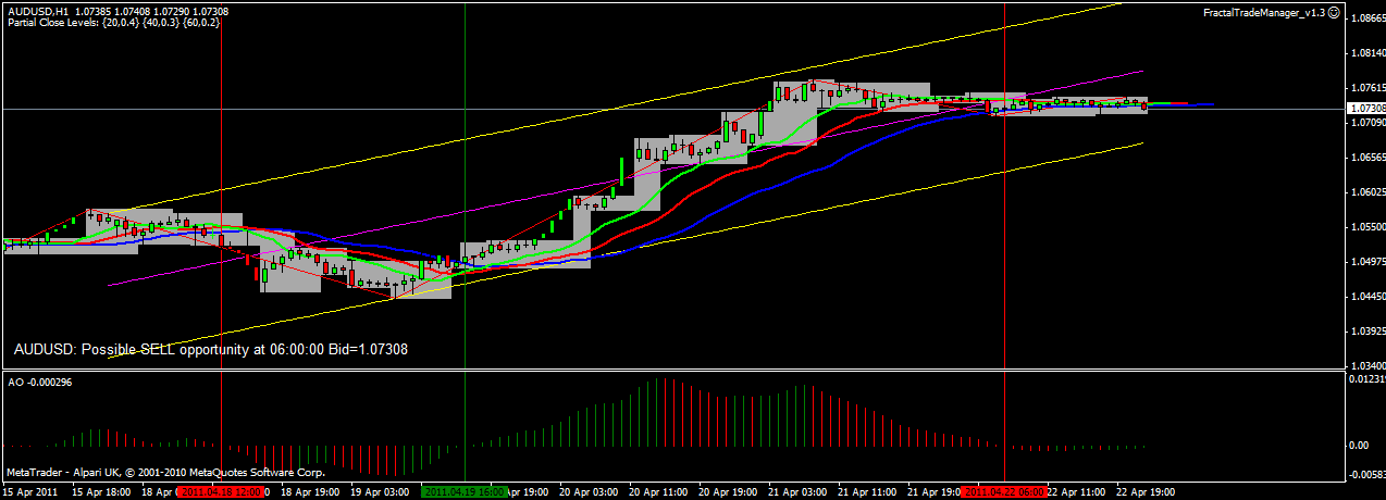
AUDUSD showing very clear trend reversal, chop periods easy to recognise, well formed fractal steps

CADCHF shows some small midweek opportunity, lots of chop otherwise,fractal steps not well formed

CADJPY showing clear reversal, low chop,  fractal steps not well formed

CHFJPY shows good reversal, low chop, fractal steps could be better

EURCHF shows good reversal, clear chop, nice fractal steps

EURGBP shows nice reversal, low chop, nice fractal steps

EURJPY shows clear reversal, low chop, good but steep changing fractal values


GBPCHF lots of clear chop, good but steep fractal steps

GBPJPY good reversal, clear chop, good fractal steps

GBPUSD Good reversal, clear chop,good support fractal steps, nice!

USDCAD very nice mid-week short opportunity

USDCHF nice short opportunity

USDJPY 2 good short opportunities, clear chop, nice fractal steps

Summary: I will continue to look at this system but would probably stick to the majors.